@f-ewald/components: an open source web component library
I’ve open sourced @f-ewald/components, a library of over 80 self-contained web components I use across my own projects, published on npm.
Every project I build ends up needing the same handful of UI pieces: buttons, dialogs, form fields, tables, a sidebar shell. I got tired of re-implementing or copy-pasting them between codebases, so over the past months I pulled the common ones out into a standalone library built on Lit. It now backs the UI of Journey and several of my other projects, and I decided it was solid enough to release publicly.
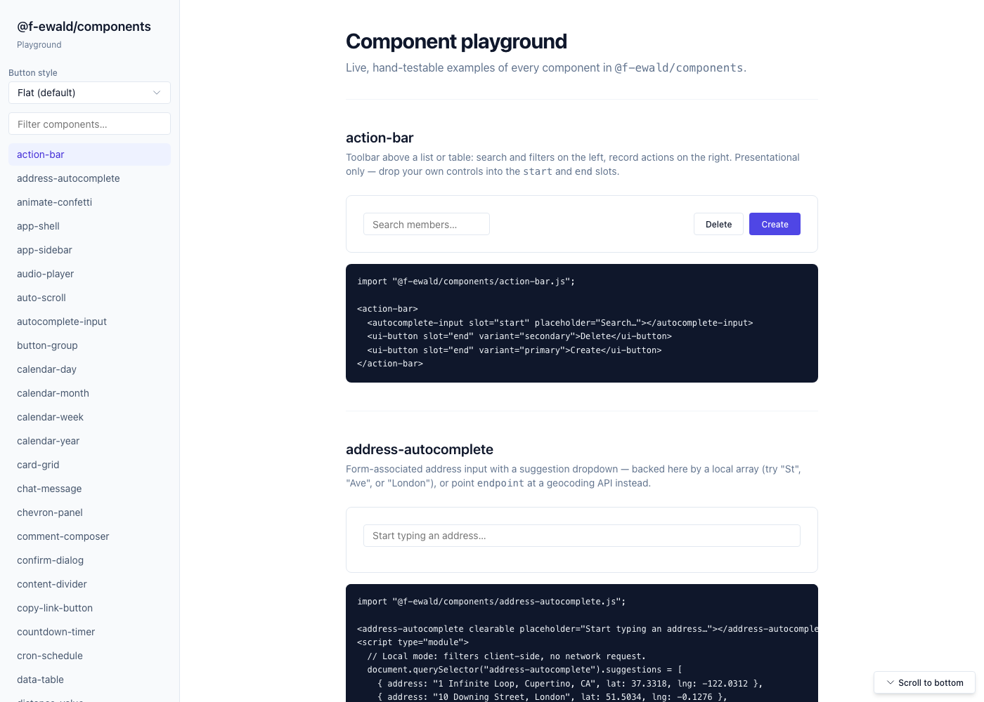
app-shell and app-sidebar for dashboard-style pages; data visualization components including charts and tables; and more specialized pieces like a markdown editor, a kanban board, and a set of calendar views (day, week, month, year). Every component ships with TypeScript types and can be imported individually, so pulling in ui-button doesn’t drag the rest of the library along with it.
A few design decisions shaped how the library works. Components style themselves through --ui-* CSS custom properties with sensible fallback values, so there’s no external stylesheet to load and no build step required to theme them — overriding a couple of variables at the root is enough. Dark mode is built in and can follow the OS preference automatically or be toggled explicitly via a data-theme attribute. Wherever a native HTML element already provides the right behavior — a <input type="range"> for a slider, a <video> element for the video player — the component wraps it instead of reinventing it, which keeps keyboard and screen-reader support free rather than something I have to re-implement by hand.
One detail I’m particularly happy with is the included MCP server, which exposes the full component catalog to AI coding assistants. Instead of an agent guessing at prop names or hallucinating a component that doesn’t exist, it can look up the exact documentation, attributes, and usage examples directly. I used this myself while building Journey, and it’s part of why iterating on that UI went so quickly.
The library is available under the BSD-3-Clause license. You can install it with npm install @f-ewald/components, browse the full documentation and playground at the project site, or read the source on GitHub.