Improving Website Accessibility
Continuing from before, I wanted to improve the accessibility on this website as much as possible. The initial Lighthouse run gave me a score of around 82, which is not too bad, but I definitely wanted to improve it.
Background and foreground colors do not have a sufficient contrast ratio
The first thing I did was to increase the contrast on the site. Several elements had a too low contrast against their background. Google recommends a contrast of 4.5:1 for text less than 18px and 3:1 for text equal or greater than 18px. Luckily there is an easy way to achieve this via the Chrome dev tools. Simply select an element that violates this rule and click on the “fix” button, then copy the new color code into the CSS. After repeating this multiple times, I reran the test and everything in regards to the contrast was fixed.
Form elements do not have associated labels
Another easy fix witharia-label. The checkbox that Lighthouse complained about is used to keep the state of the side menu.
<input aria-label="Sidebar" type="checkbox" class="sidebar-checkbox" id="sidebar-checkbox">User scalable
As a last step it was recommended that I change the maximum viewport scale level to 5. All I had to change was one line.<meta name="viewport" content="width=device-width, initial-scale=1.0, maximum-scale=5">Results
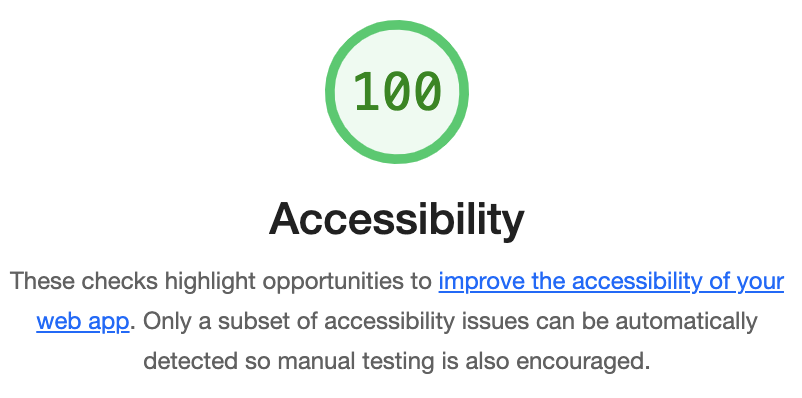
After these three relatively minor tweaks, I was able to reach an accessibility level of 100.